
CONTEXT
Kokuyo is an accomplished stationery company headquartered in Osaka, Japan.
The company holds a competition for stationery design annually, and for their 2027 edition their theme was dialogue - the interaction between an object, its environment, and the user.
For this competition, I aimed to solve a problem in stationery using a simple product with an artistic bent, especially when looking at past winners.
After mulling over the theme for a bit, I settled on journaling as the subject I wanted to tackle, due to the natural dialogue between a user and their journal.
Before I developed any concepts, I conducted research and interviews to narrow down the challenges of journaling.
“I mostly journal to get thoughts off that I can’t tell to anybody else.“
Man, 21
“I tried to journal for a few weeks, and it made me a lot less stressed; but I wasn’t inspired enough to write after a while.“
Woman, 20
“I need as few barriers to starting to write as possible, since I have ADHD.“
Woman, 23
“I write to my journal like talking to a friend, and I feel more collected when I write to it.“
Woman, 20
Overall, I found that journal users struggle to keep writing as a habit outside of emotional outbursts, and through my research I also found that existing journals providing prompts were far too rigid. I saw opportunity to create a piece of stationery with inspiring elements to help keep people journaling for longer.
IDEATION
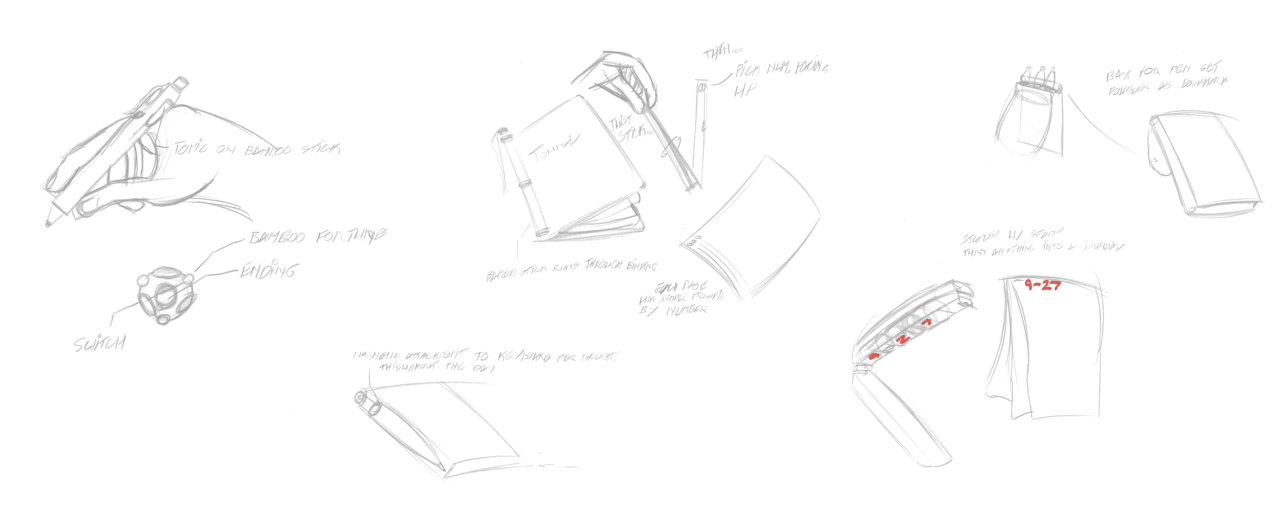
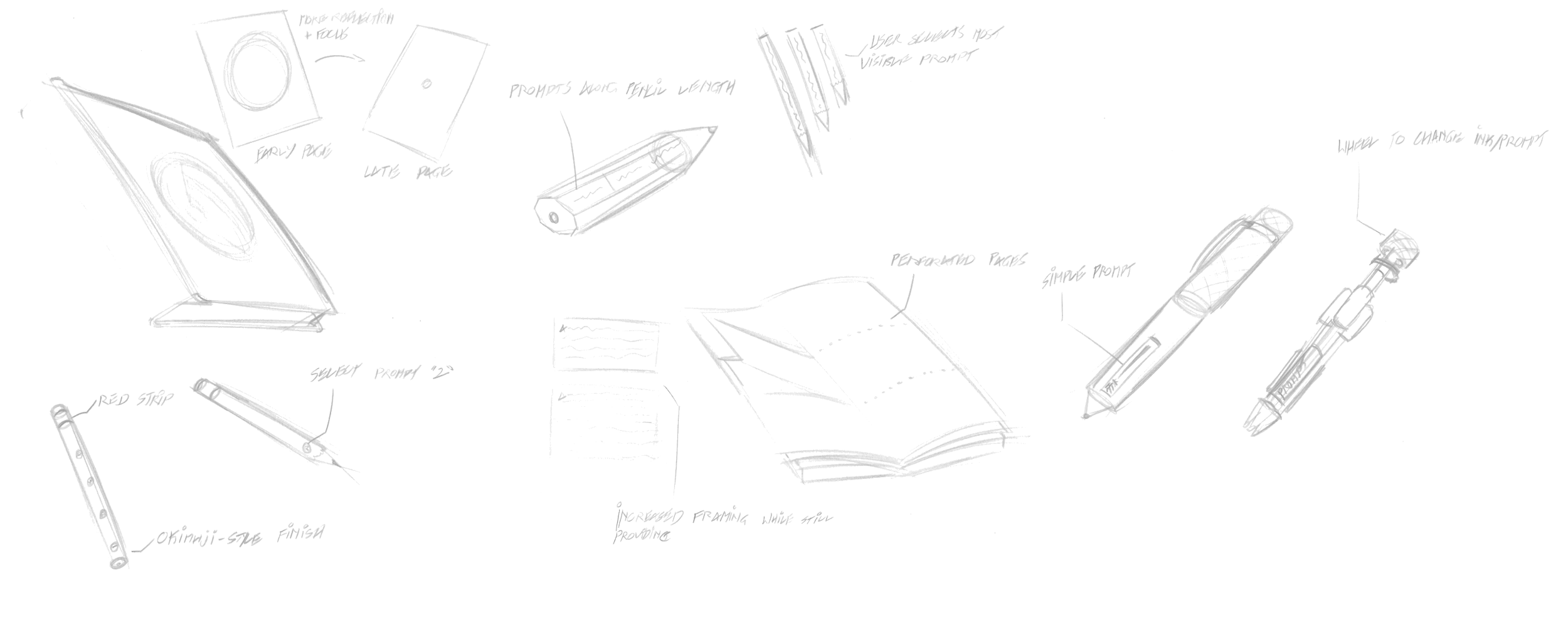
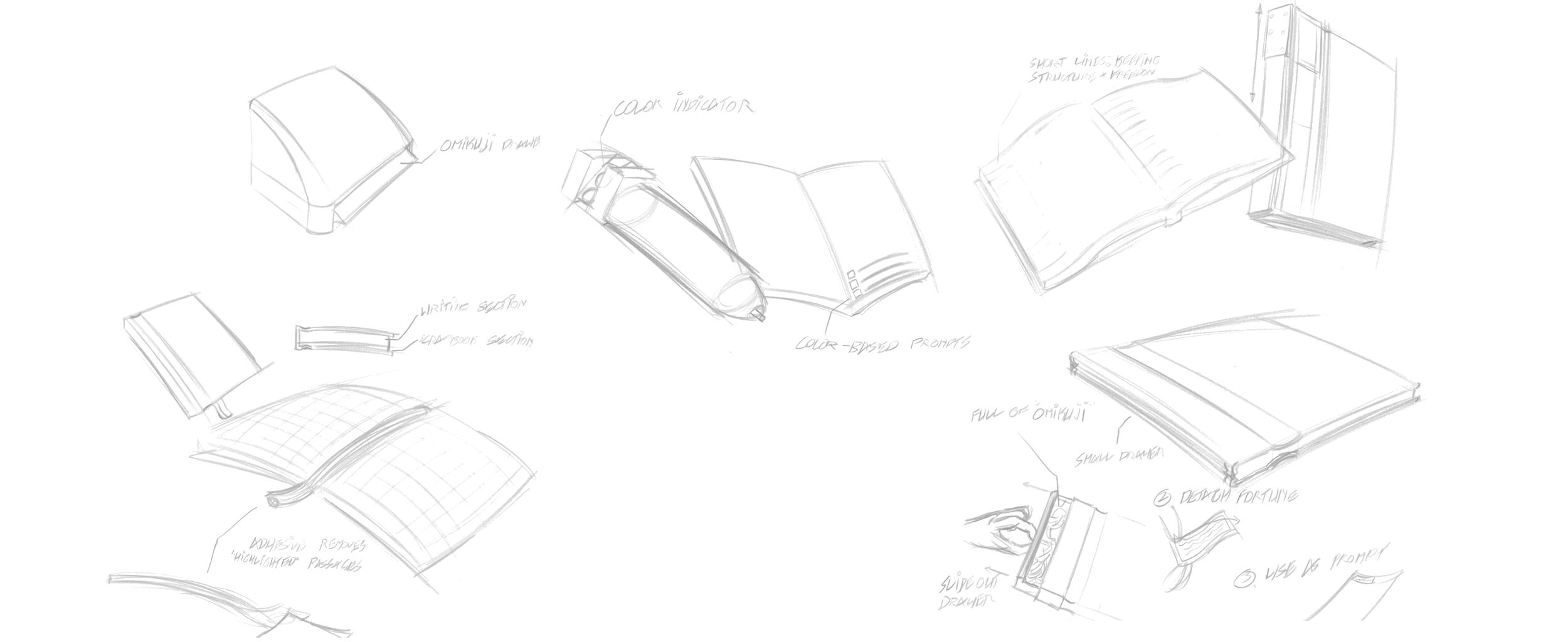
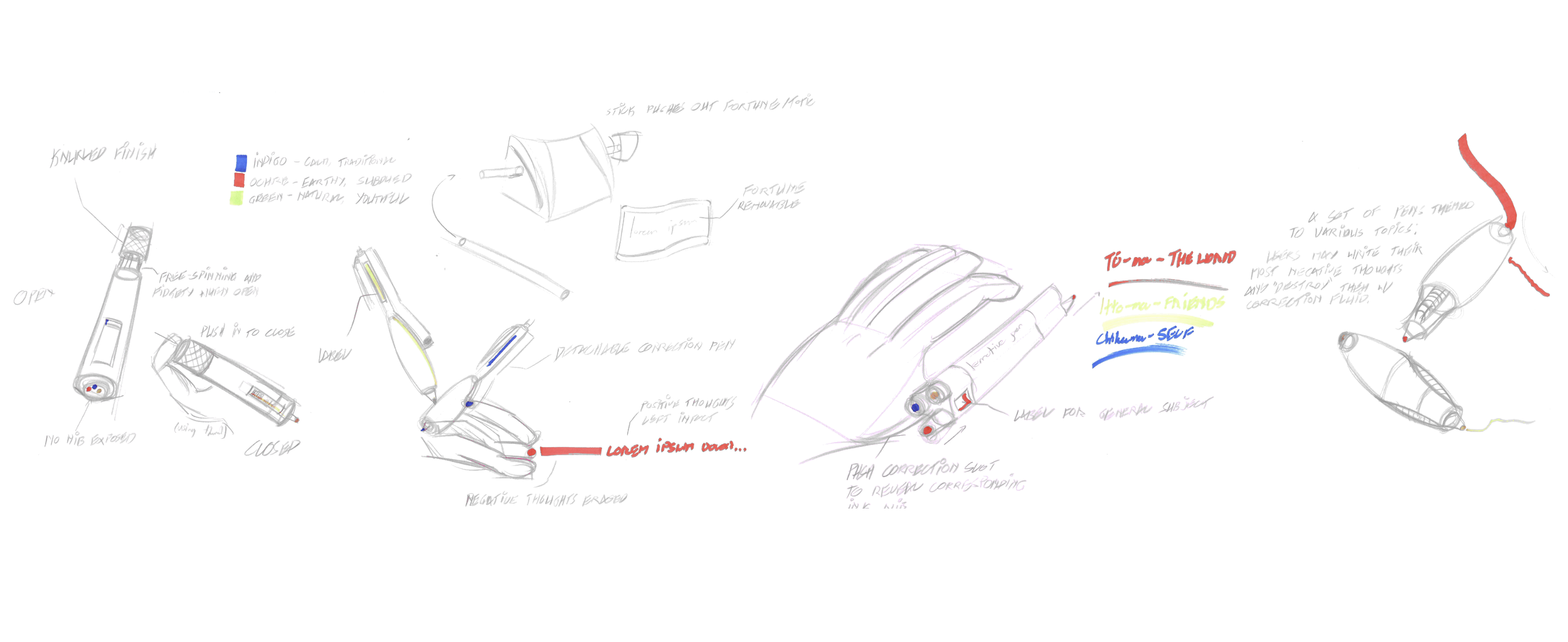
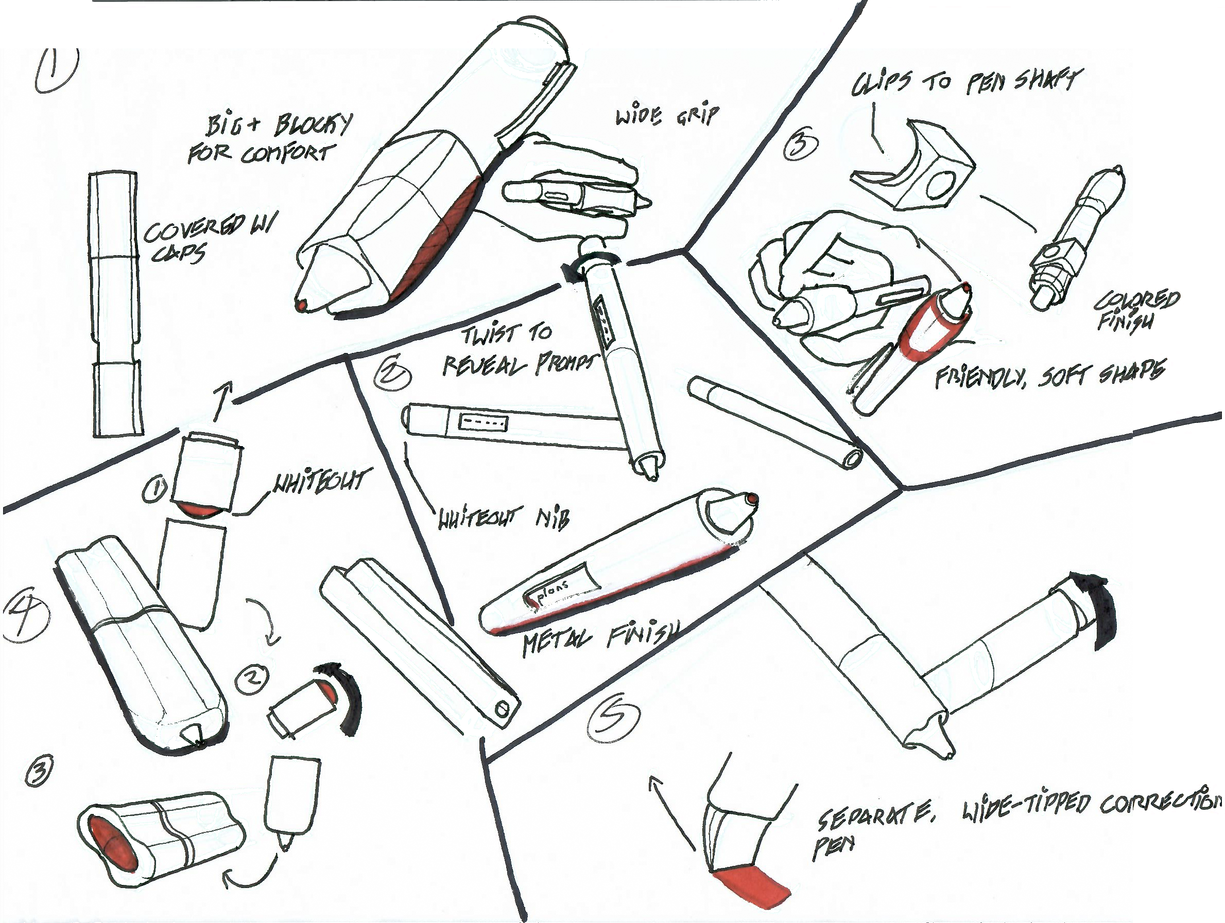
My early ideation focused on a mix of different stationery items, generally including a prompt in a range from low to high-specificity.
Art-forward, cathartic outlook; each pen has a reservoir for both ink and correction fluid, where users can "correct" their most upsetting thoughts
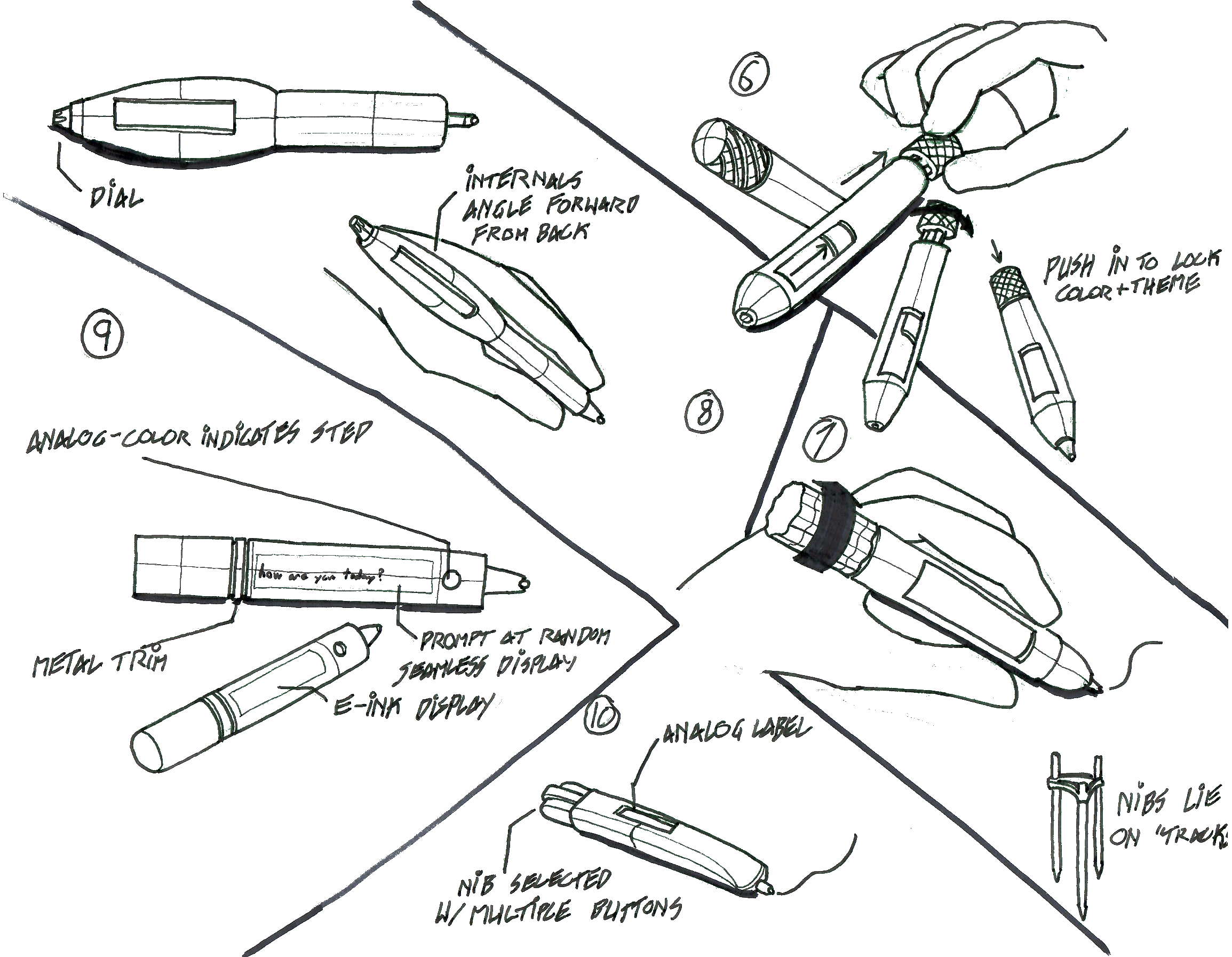
3-color twist pen, where the user twists a cap on the back of a pen, bringing up a short prompt for the user; the basis for the final design
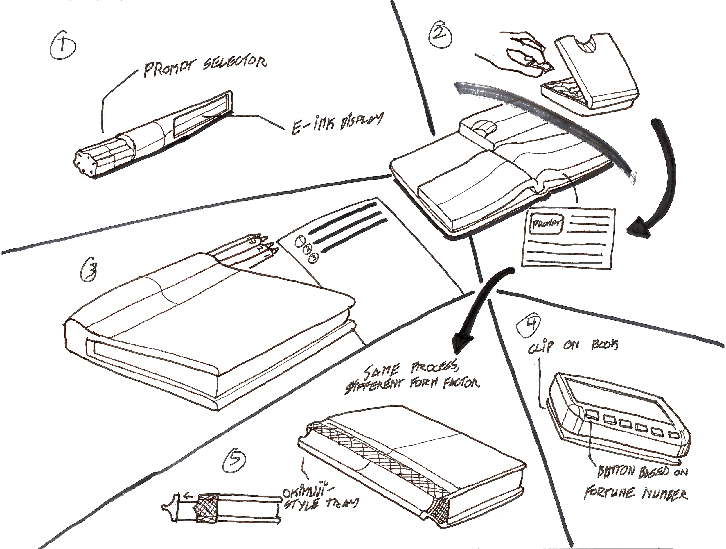
Based on "Omikuji" - the user draws a prompt using bamboo sticks or other means, attaching it to their journal, when they run out of ideas
Mockup Testing
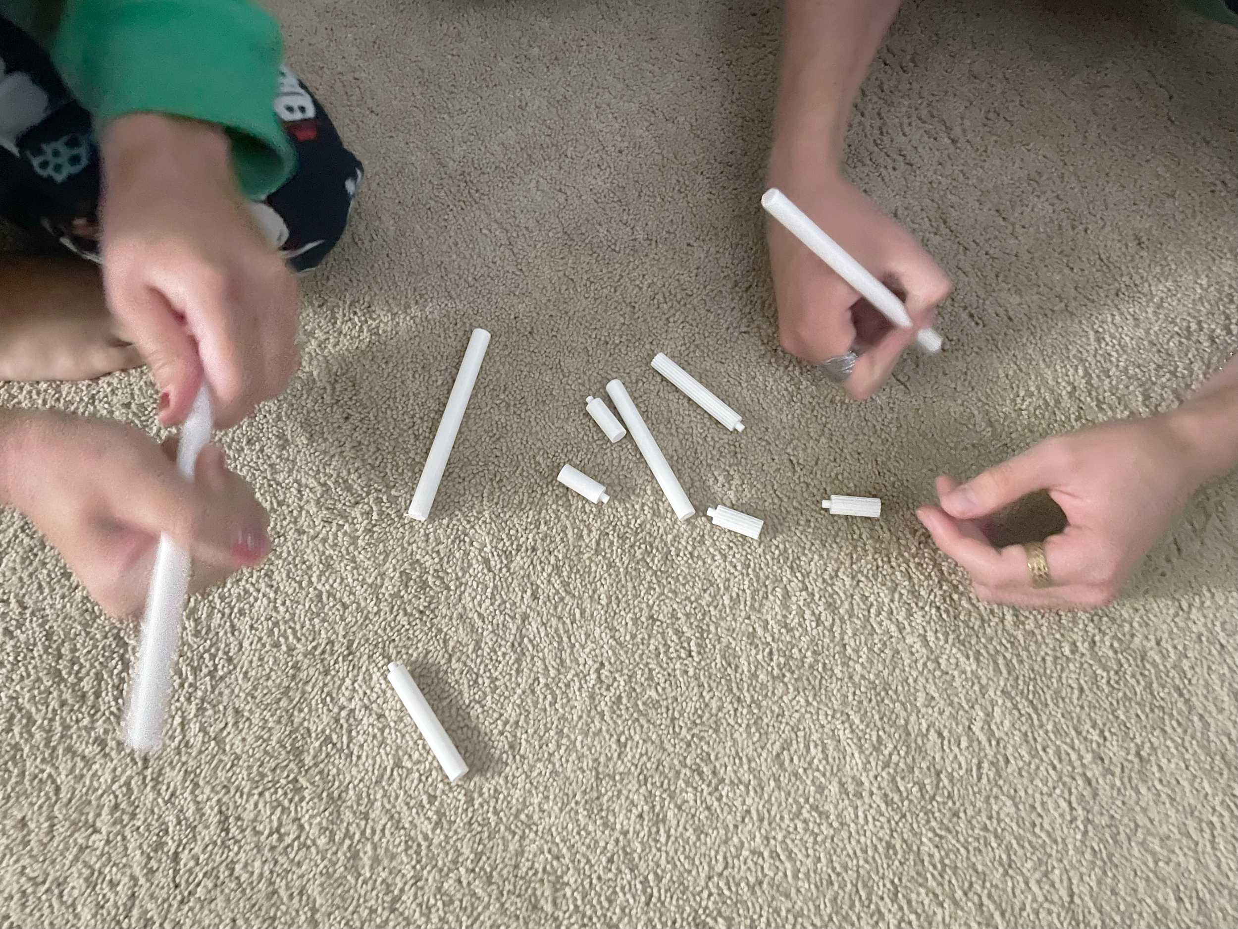
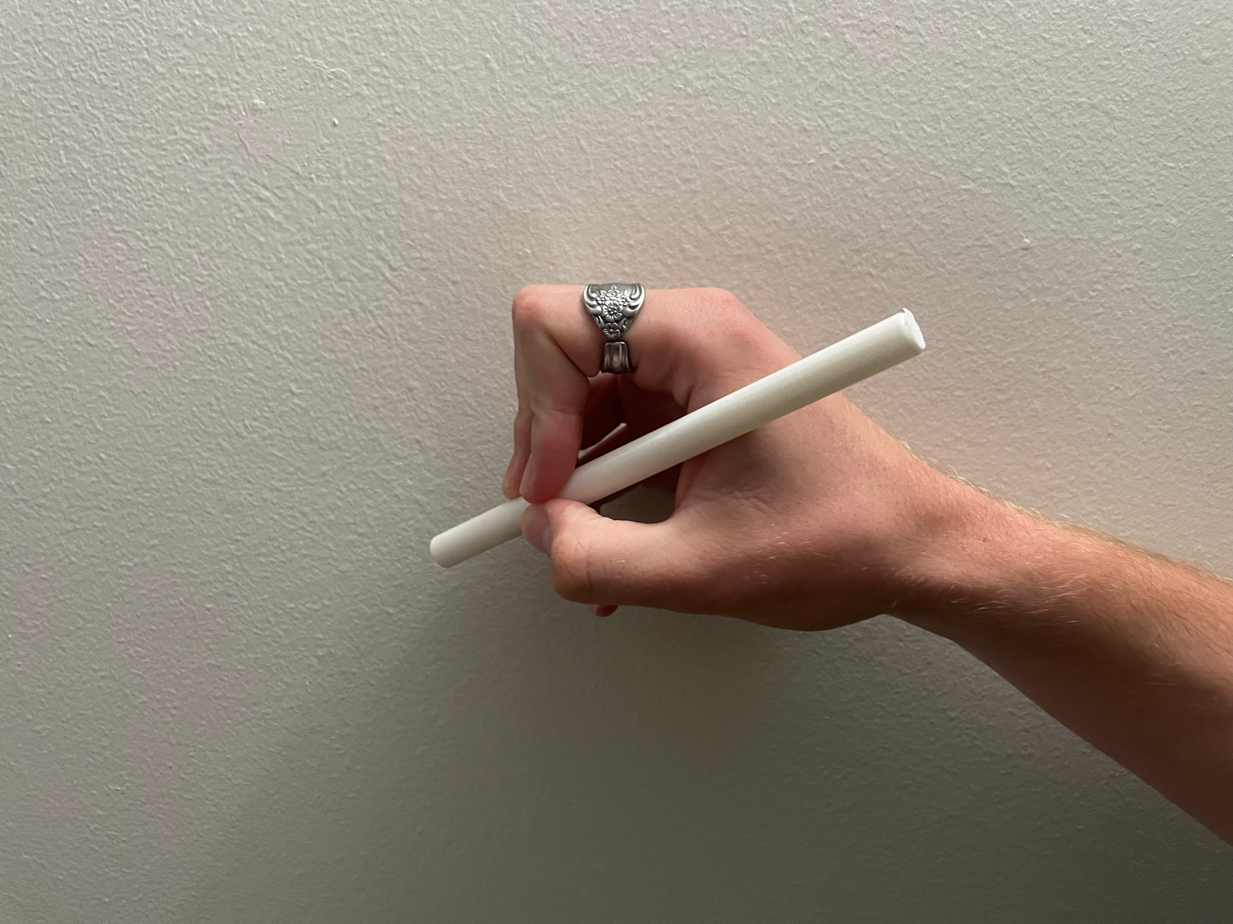
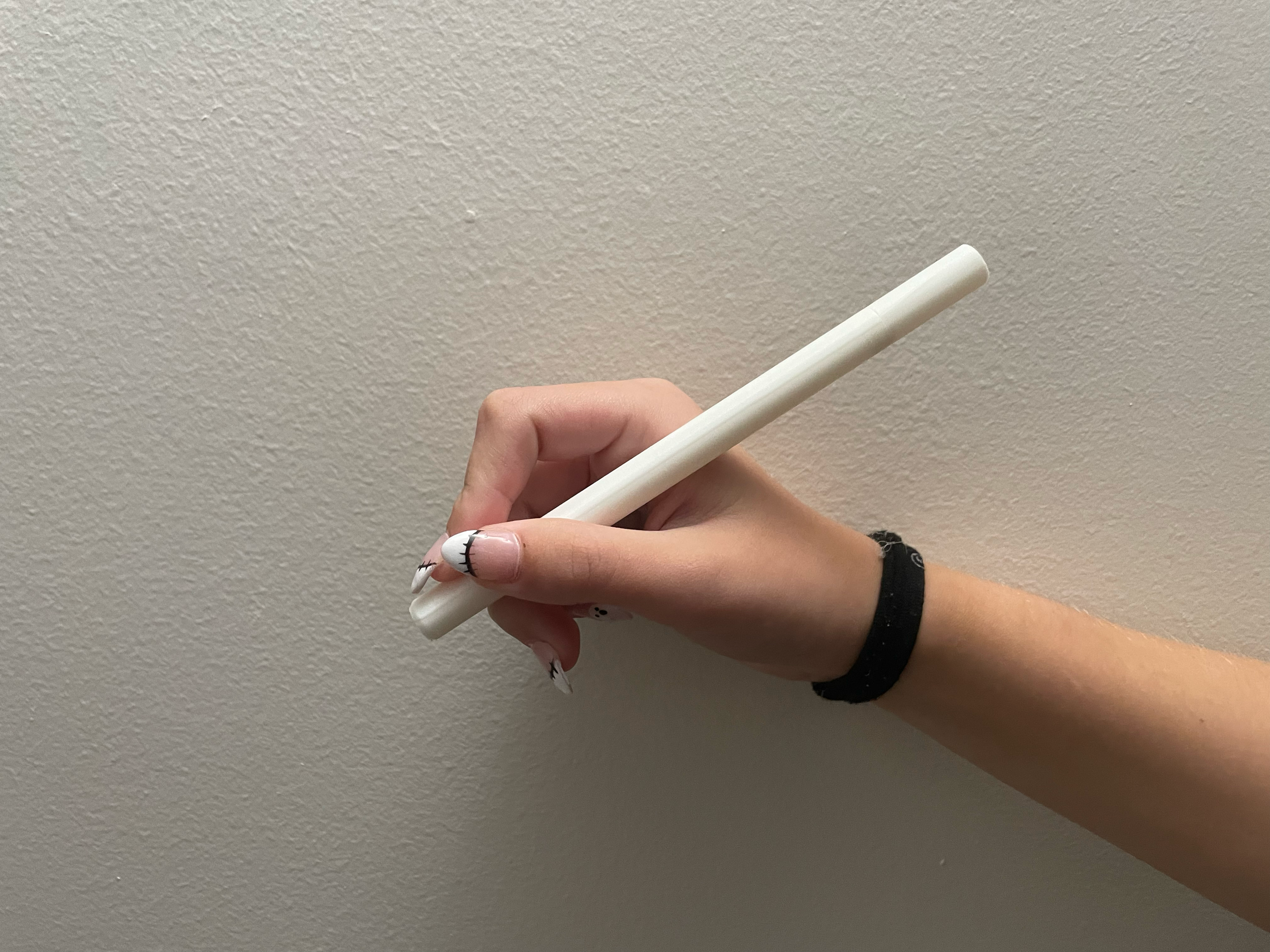
Once I decided on the twist pen as a concept, I created a series of 3D-printed parts to test the ergonomics of the twisting motion with my interviewees. I biased my mockups towards a larger size to accommodate the mechanism and improve comfort, but not enough to be overly bulky.
My interviewees ultimately opted for a relatively long, thin design with a twist cap merging with the larger form. They also preferred the simpler appearance, which matched what I already planned for the pen’s appearance.
FINAL
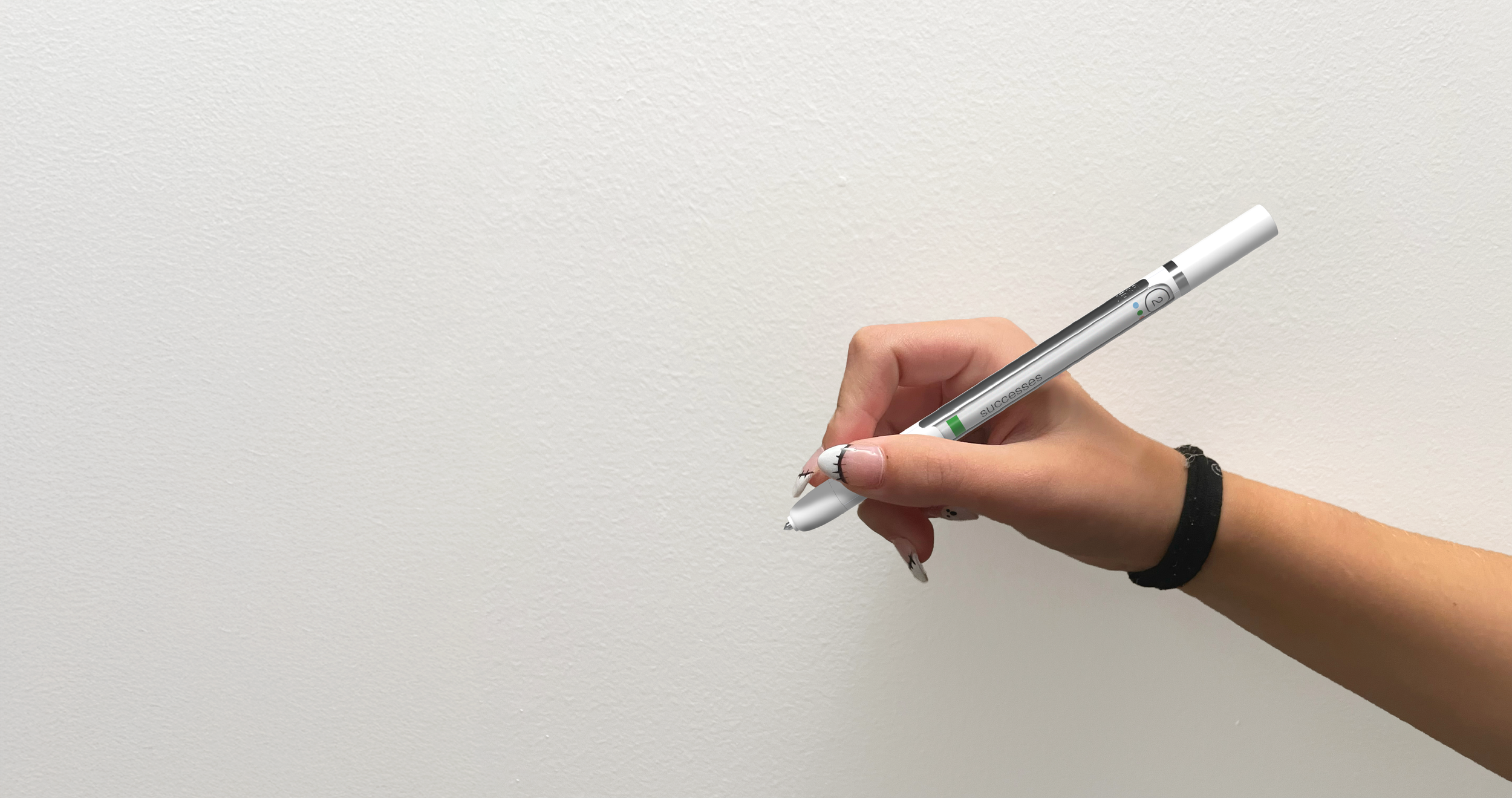
Joka is a twisting 3-color pen with a broad prompt label and step associated with each color.
Writers are instructed to write about their most pressing challenges first, then write about their successes, and finally reflect on them. This both helps writers organize their thoughts and brings basic structure to a chaotic journal.
As novice journal writers pick it up as a habit, the label fades into the background, allowing the writer’s creativity to take hold while the pen’s color still provides utility as an organizational tool.
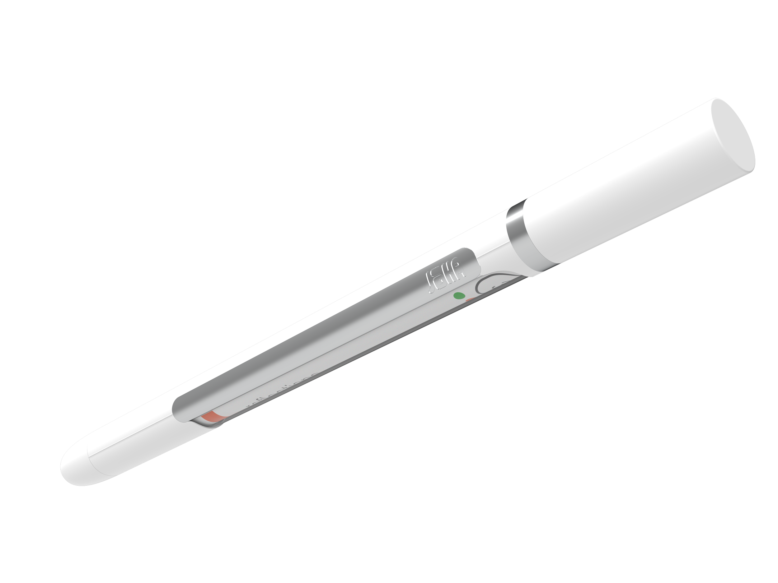
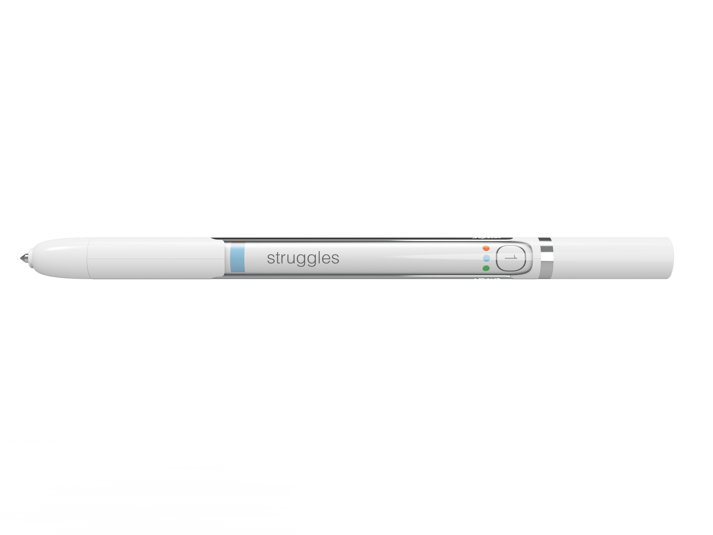
1 - The first step of the journal, where the user vents; in a bright blue, which intentionally strains the reader to reread
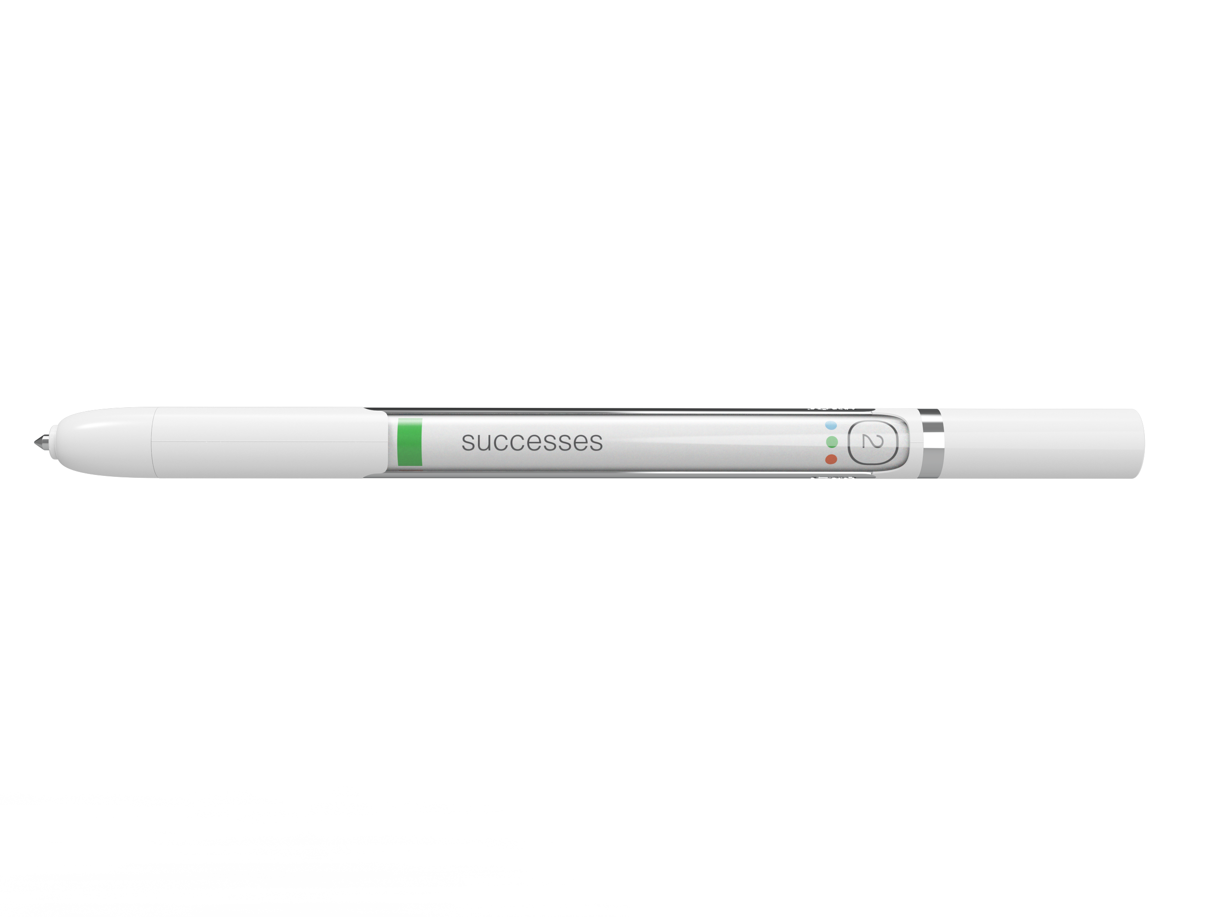
2 - The user writes about their successes and reframes their journal in a positive direction; in a vibrant, legible green
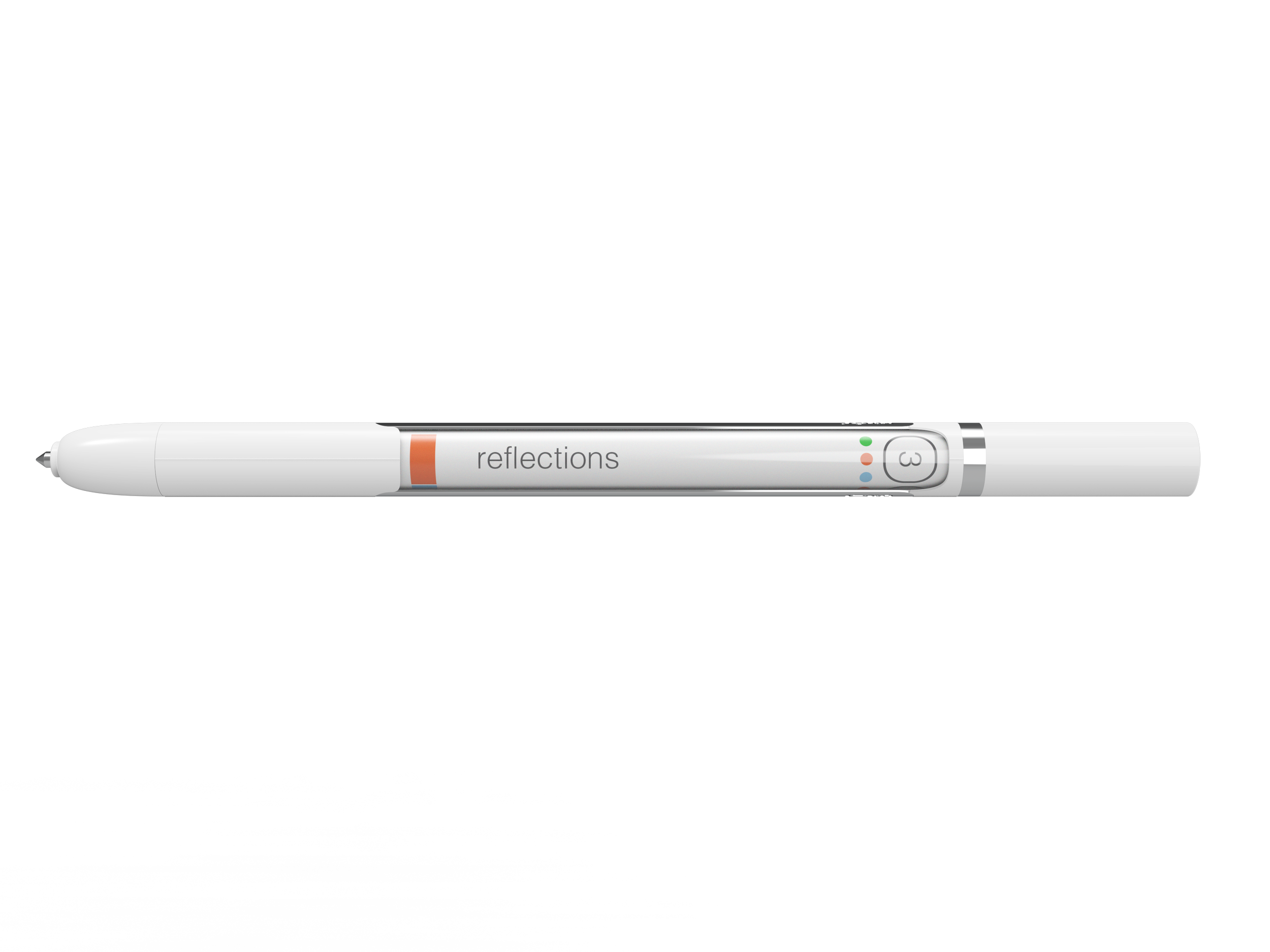
3 - The user reflects on their writings for the day and sets future plans; colored as a sharp ochre which is easy to read